
Layout, design and features …
In order not to miss any details, we first created a 360° view of the NZXT Lift 2 Ergo.

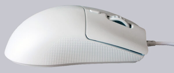
A rather unique feature of the Lift 2 Ergo is the rough surface on both sides of the mouse to improve grip. The small bumps are clearly noticeable, but are merely a matter of getting used to them and are by no means annoying.
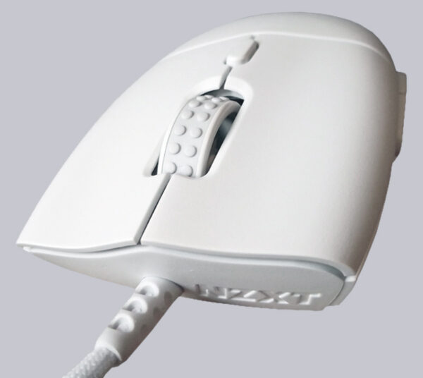
Viewed from the front, the indentations of the brand logo and the first beginnings of the cable with strain relief can be seen. The mouse wheel has large knobs, which can even be a little annoying and are always present. A finer ribbing such as on the MM712 from Cooler Master would have been perfectly adequate. As usual, the mouse sensitivity can be adjusted via the button above the mouse wheel; in this case in 5 levels.
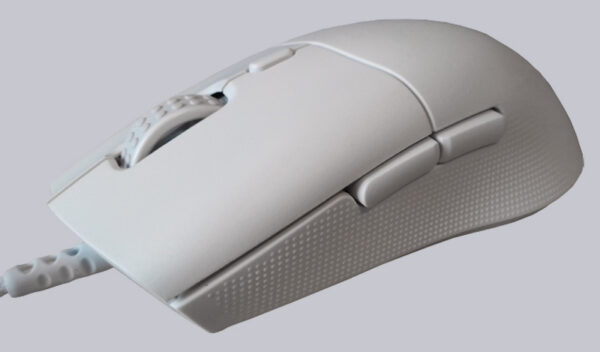
Due to its almost completely white surface with a single gray accent (mouse wheel), the product looks relatively unspectacular, which is reinforced by the straight lines. However, anyone who doesn’t need a colorful LED display will certainly enjoy it.
Of course, we would also like to show a picture of the black NZXT Lift 2 Ergo, which of course has a black cable.
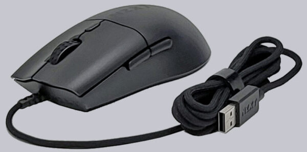
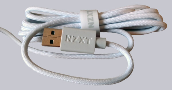
With a cable length of 2m and a very dense sleeve, NZXT has certainly not cut corners. This type of sheathing is often used for keyboards and mice, which certainly enhances their value.
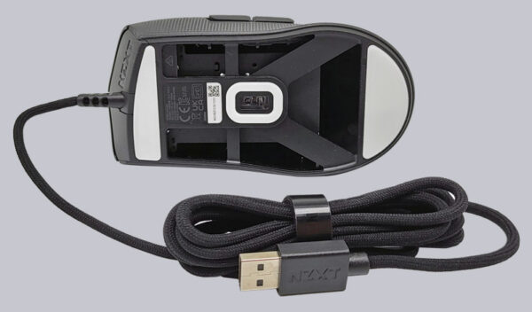
In addition to the PixArt PMW3395 optical sensor and the PTFE glide pads, the underside of the mouse also features an interesting design. The lightweight construction not only saves weight, but also material. Here you can also see the paracord cable of the mouse, which weighs just 60 grams.
NZXT Lift 2 Ergo Software …

